“Introduction to Architecture” Redesign
Project Overview ︎︎︎
This is a layout and grid system practice project, the aim was to enhance readability and create an improved design for the readers.
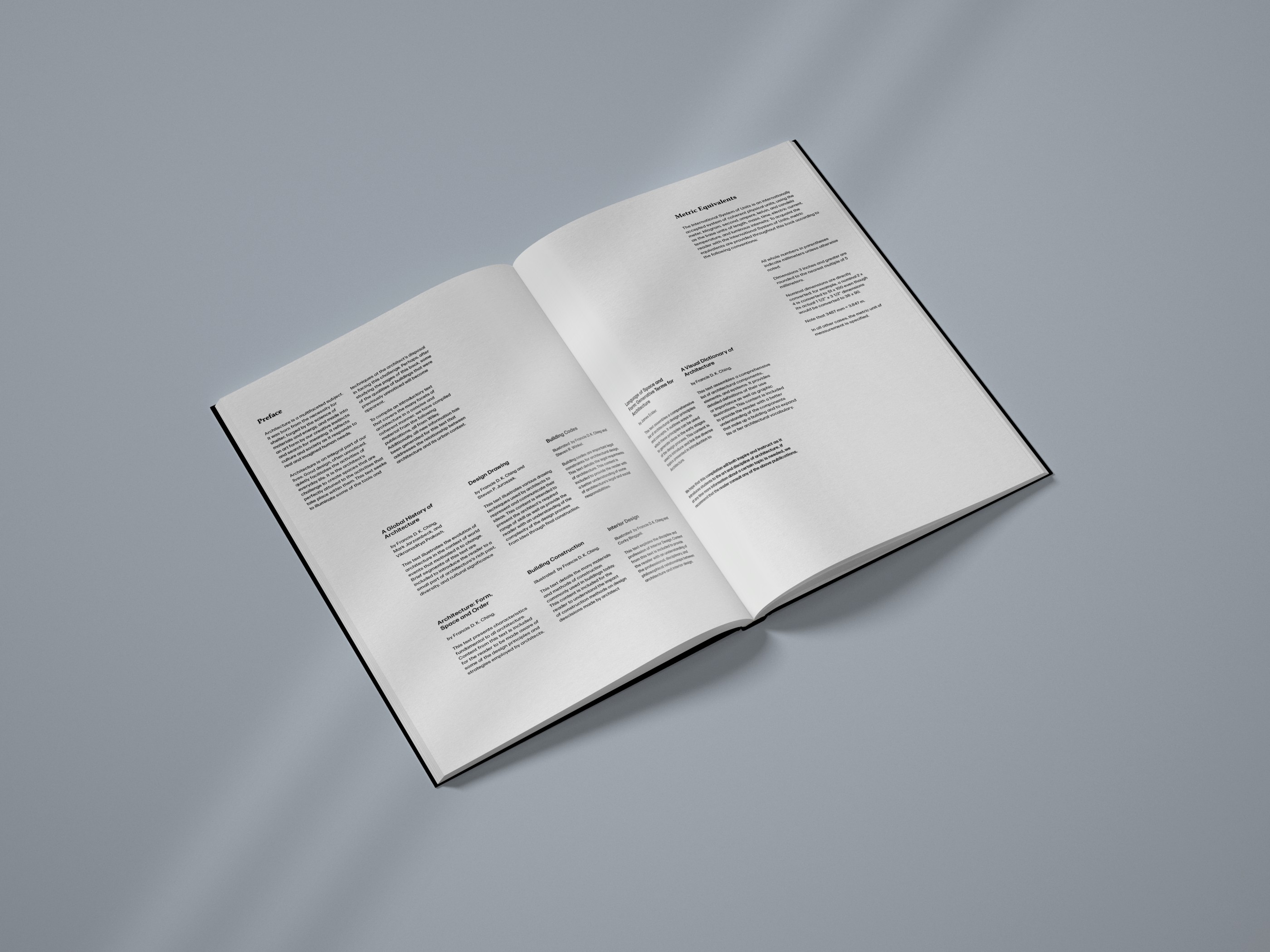
In the “Introduction to Architecture” editorial layout project, the focus was on redesigning a textbook that had compelling content but lacked readability and flow in its original design. The approach involved utilizing the graphics from the original book without introducing additional decorative elements, emphasizing a pure exploration of layout possibilities to enhance readability for readers.
Responsibilities:
Editorial Design, Project Research
Editorial Design, Project Research
Tools:
Adobe Illustrator, Adobe Photoshop, Adobe InDesign
Adobe Illustrator, Adobe Photoshop, Adobe InDesign
Duration:
1 Month
1 Month
Type:
Editorial Design
Editorial Design
Challenge ︎︎︎
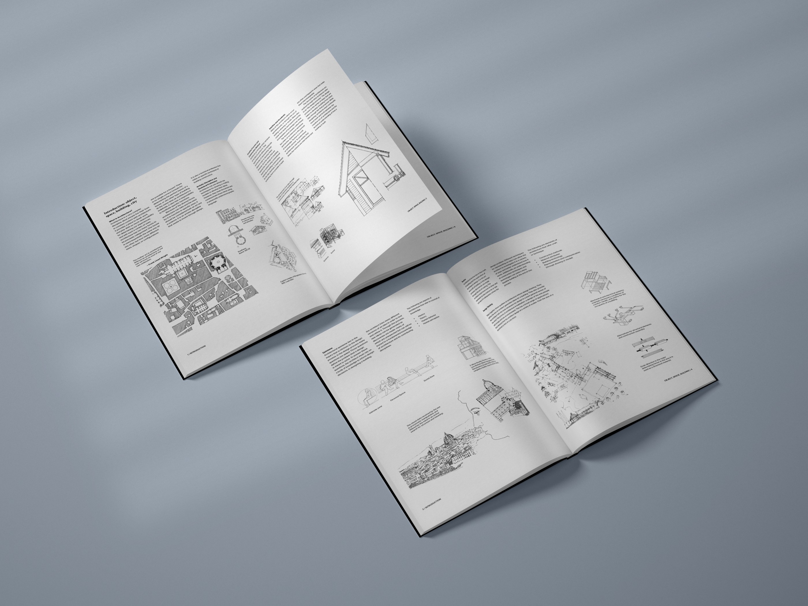
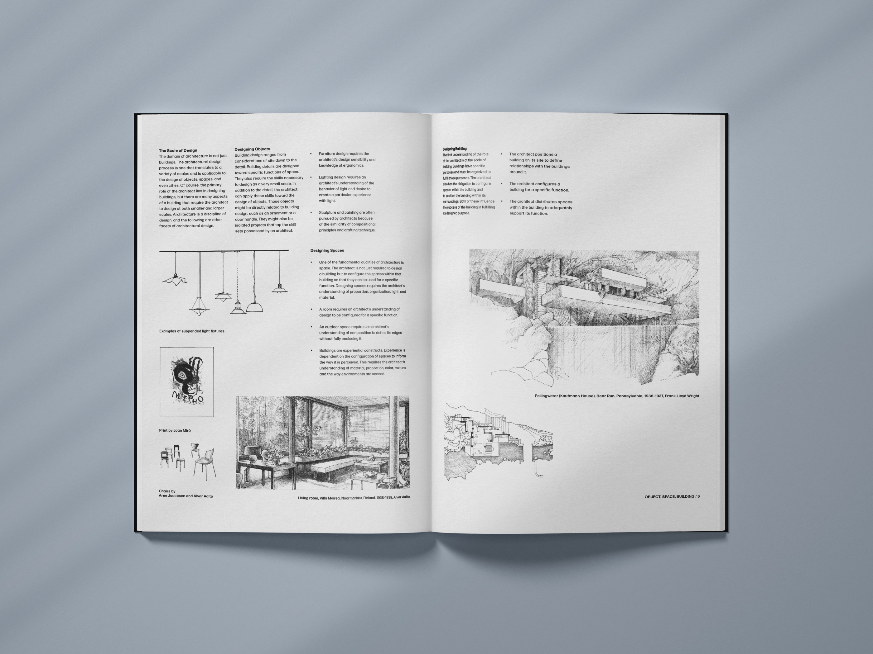
A challenge in this project was managing numerous images associated with the original text. The abundance of imagery was crucial, but integrating them into a three or four-column layout posed a spatial constraint.
Additionally, finding a balance between enhancing readability and preserving the integrity of the original graphics posed another significant challenge.
Solution ︎︎︎
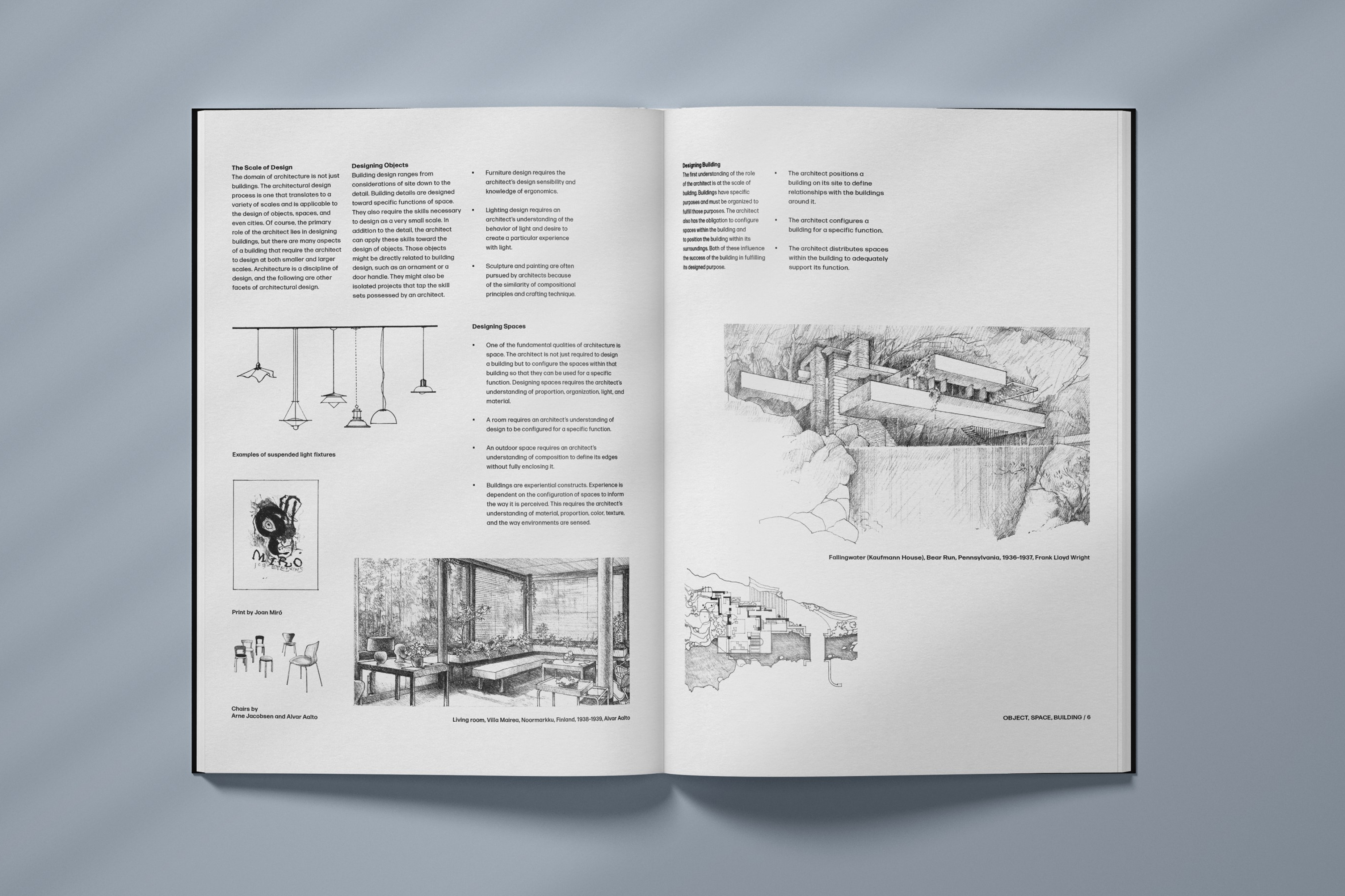
To address the layout challenge, I opted for a combination of a 3-column structure at the top and a 7-column layout at the bottom. This approach provided more flexibility in arranging the images and improved overall readability.
Process Overview
Research ︎︎︎ Ideation & Concept ︎︎︎ Visuals ︎︎︎ Refinement
Reseach ︎︎︎
Since this is a layout and grid system practice, explore different grid systems used in editorial design. Understand how grids can be applied to organize content effectively. I also tried to stay updated on contemporary typography trends in editorial design. Choose fonts that align with the subject matter and enhance the overall visual appeal.
Ideation & Concept ︎︎︎
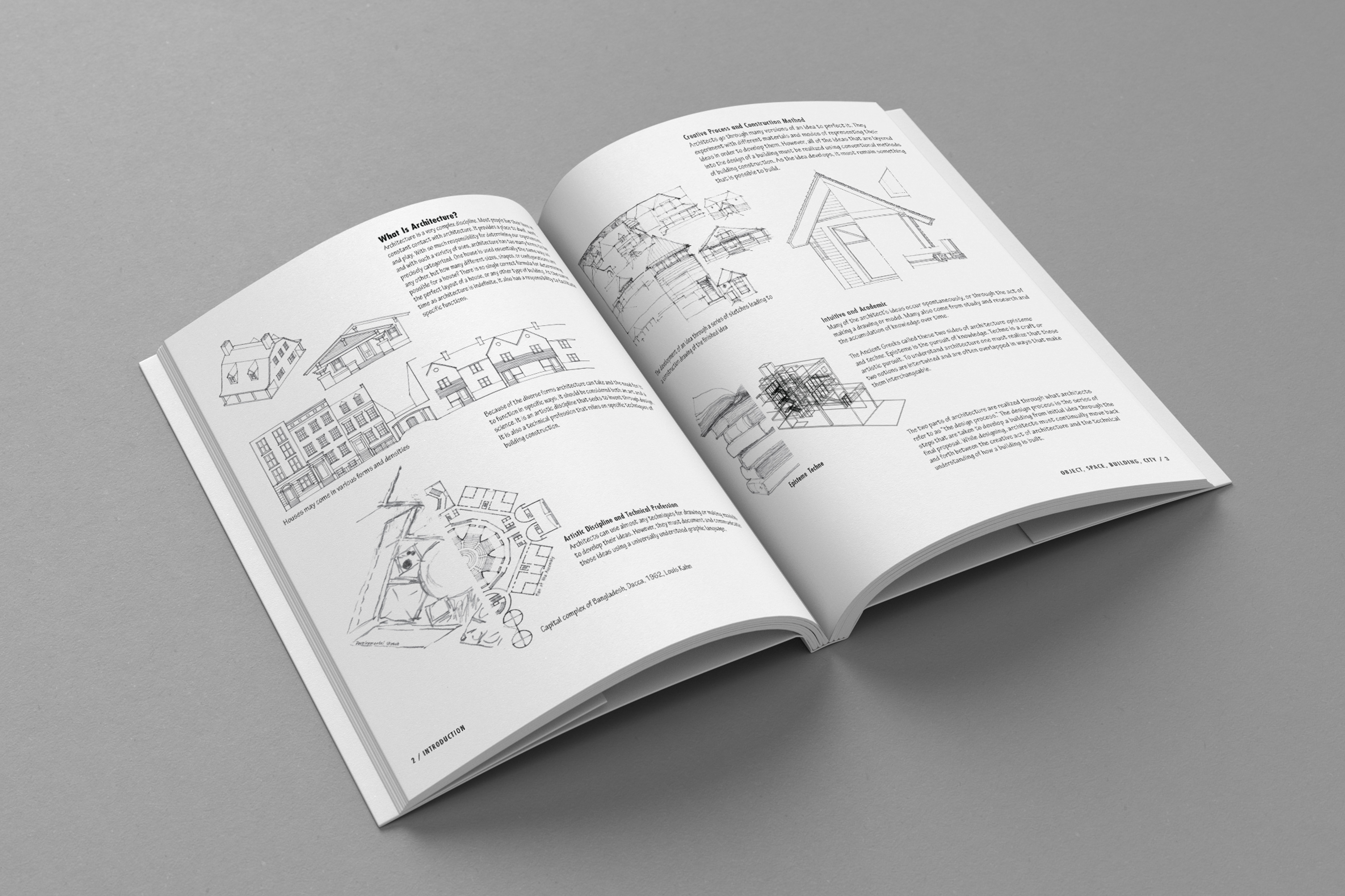
The layout of the book "Introduction to Architecture" employs a two-column grid, initially giving the impression of readability. However, upon closer examination, the leading between sentences is overly tight, hindering legibility. Additionally, the use of a rounded stroke and condensed font contributes to readability challenges. Another issue lies in the lack of contrast between images and text, as the previous designer failed to establish a clear hierarchy for the reading order.
The ideation process will focus on enhancing readability and visual hierarchy. Exploring a combination of three and seven-column layouts could provide more flexibility in arranging images while addressing the issue of tight leading. Experimenting with font choices that prioritize clarity and legibility will be crucial, aiming to improve the overall reading experience. Establishing a clear hierarchy between images and text will involve thoughtful placement and sizing to guide readers through the content seamlessly.
Original Design ︎︎︎
Visual ︎︎︎
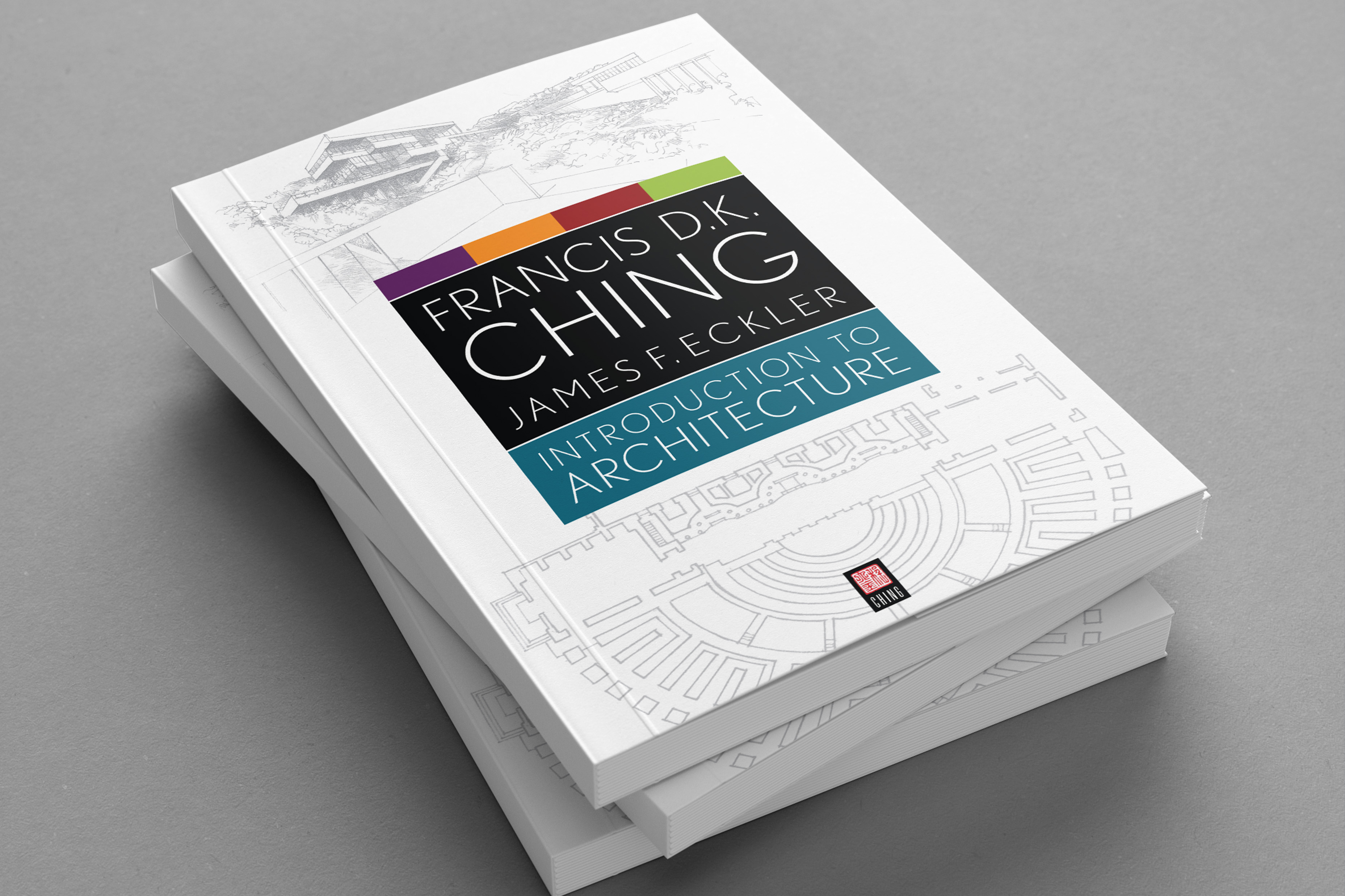
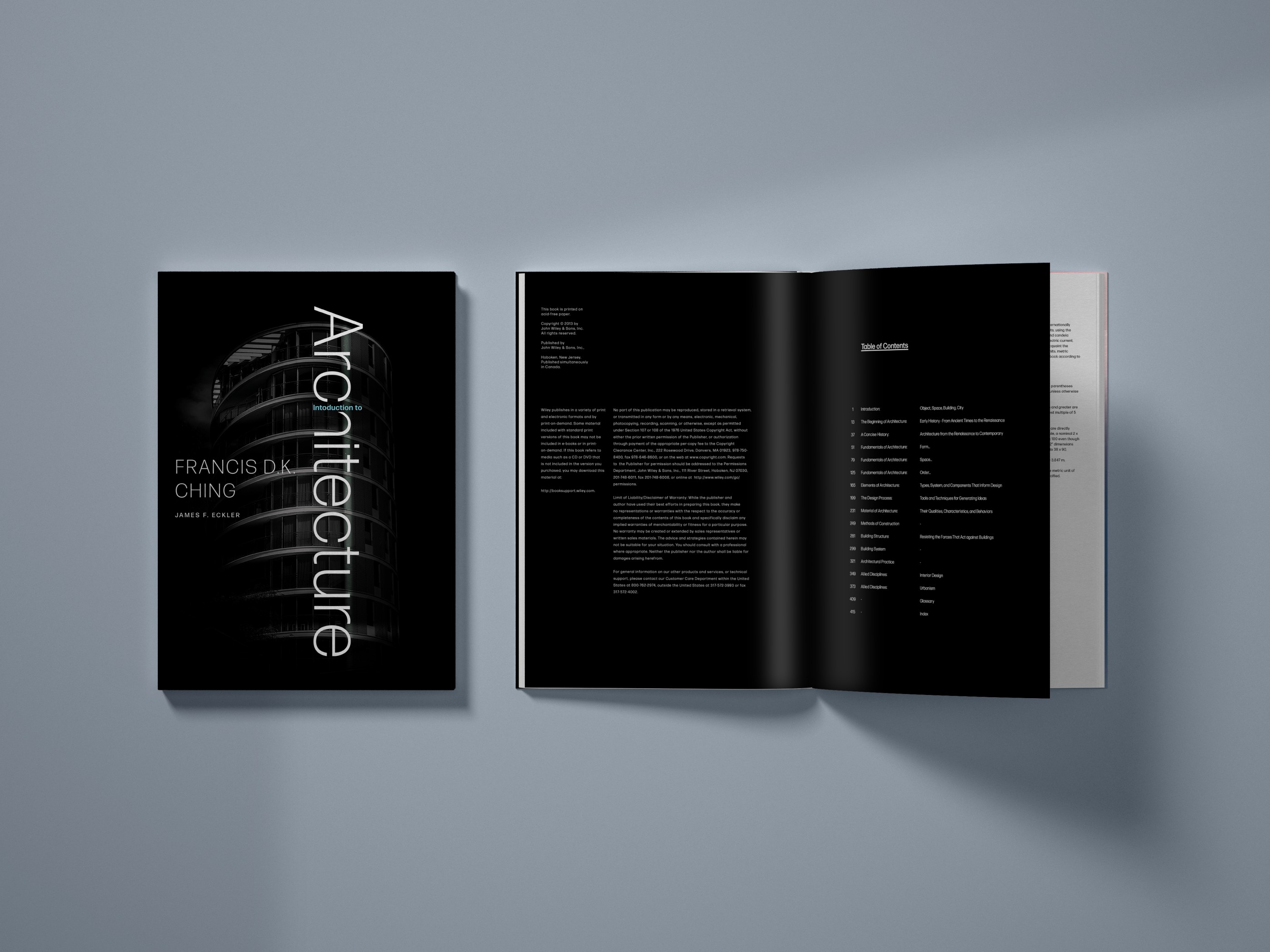
In the design process, I initiated with the book cover, opting to downsize "Introduction to" and integrate it as the stem of the letter "h" in "architecture." This subtle yet playful touch aimed to draw attention while maintaining a cohesive design. Prioritizing the prominence of "architecture" and the author's name, I then established the book's grid, implementing a three-column structure based on the cover layout to maintain consistency and visual harmony throughout the publication.
Refinement ︎︎︎
During the refinement phase, I recognized that the initially implemented grid system was not as effective as envisioned. To address this, I introduced an additional grid, utilizing a 7-column structure for images and a portion of the text in the lower two-thirds of the page. This adjustment aimed to enhance visual balance and optimize the layout for improved readability and aesthetics.
Final Outcome ︎︎︎

Personal Takeaway︎︎︎
This project reinforced the importance of a well-thought-out grid system in editorial design. It highlighted the significance of adapting and refining the layout to strike a balance between readability and the integration of visual elements. The experience underscored the nuanced decisions involved in creating an effective and visually appealing design while maintaining the integrity of the original content.