Brand Identity - Pipi Hobbies & Games
Project Overview ︎︎︎
Pipi Hobbies and Games, an online hobby store, focuses on the retail of anime merchandise and Pokemon cards. The brand positioning revolves around a youthful, energetic, and interesting aesthetic.
Pipi Hobbies and Games originally operated under the name PIPITCG, specializing in the exclusive sale of Pokemon cards during the initial phase. TCG, representing Trading Card Games, was integral to our brand identity at that time. Inspired by my personal hobby of collecting Pokemon cards, therefore we aimed to incorporate Pokemon elements into the logo.
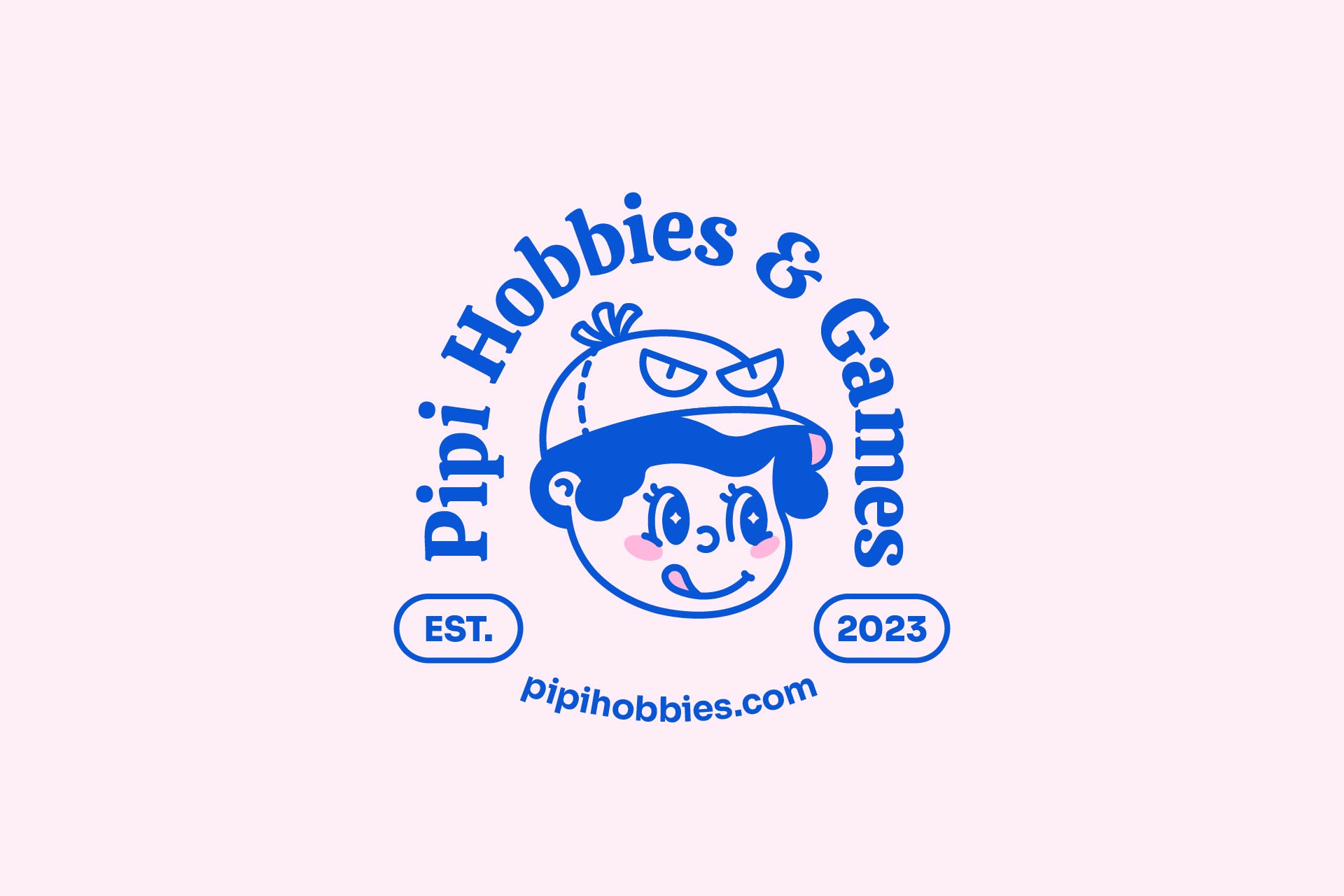
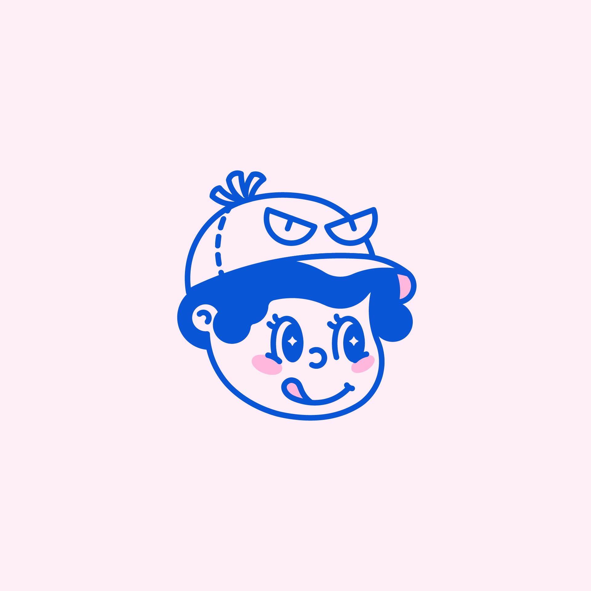
With the evolution of our business and an expanding customer base, a decision was made to undergo a small rebranding effort, giving rise to a new logo for Pipi Hobbies and Games. Both versions of our logo seamlessly merge illustration and typography, meticulously crafted to enhance the brand's visual identity.
Responsibilities:
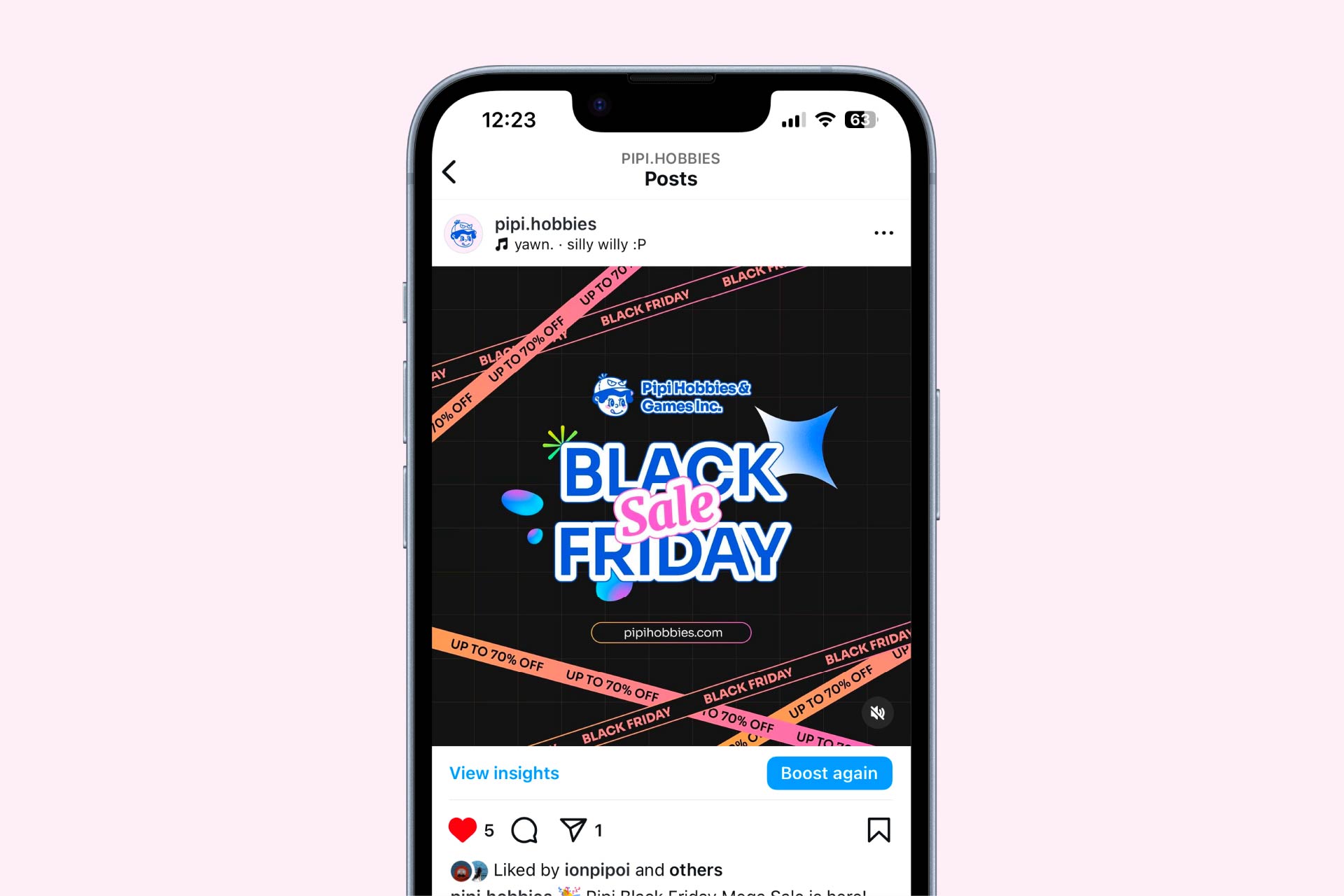
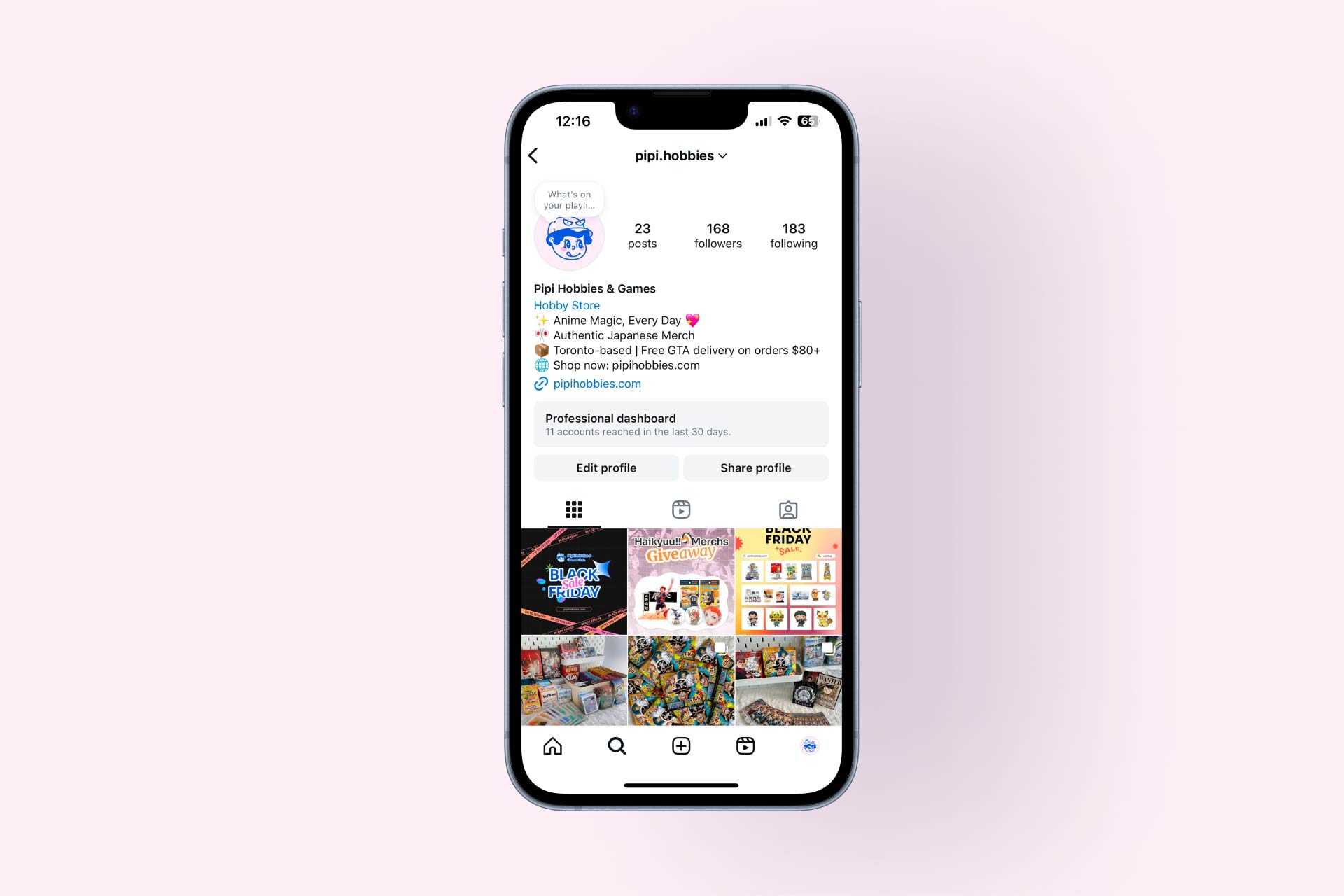
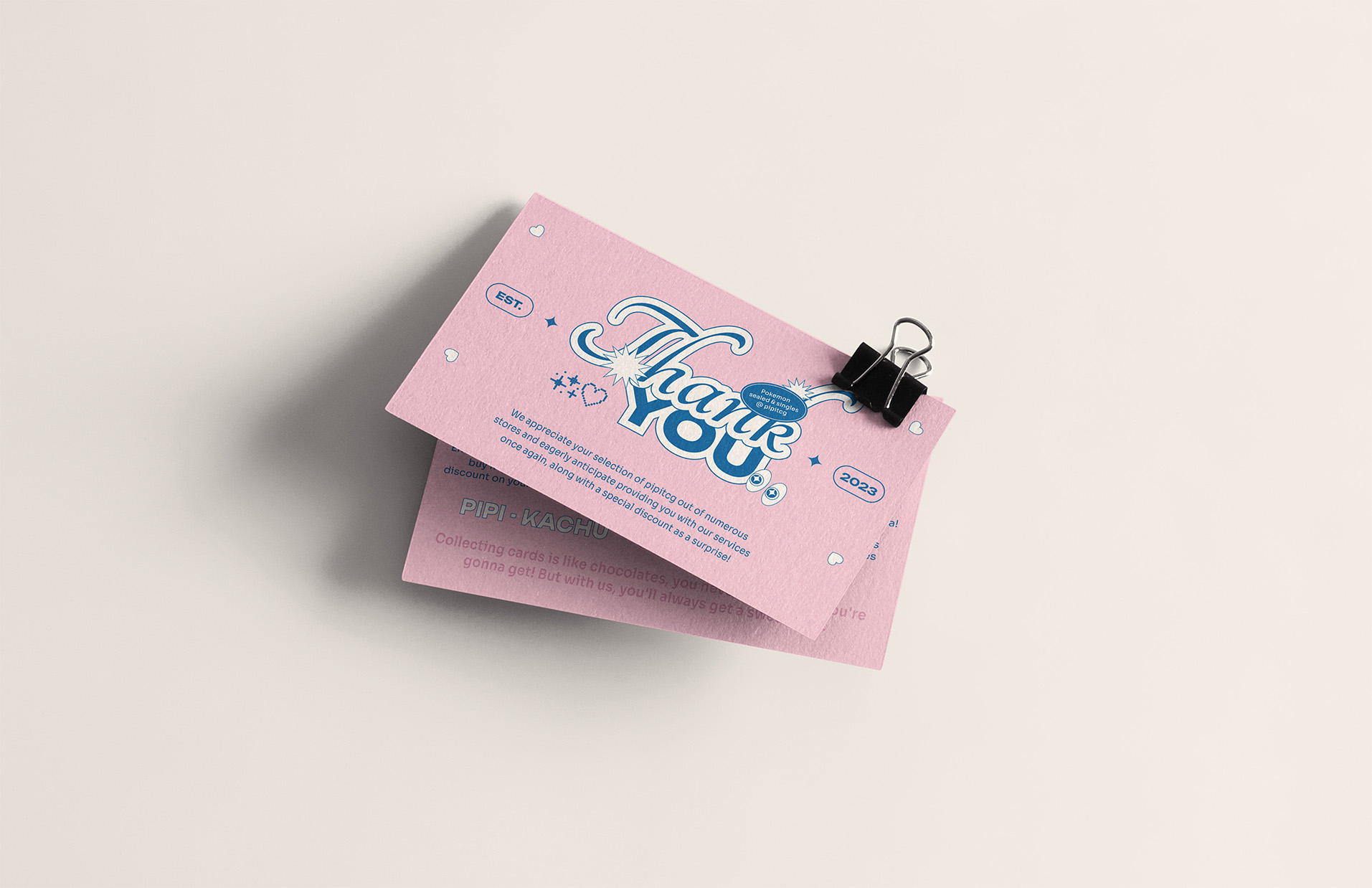
Logo Design, Poster Design, Brand Identity, Social Media Content
Logo Design, Poster Design, Brand Identity, Social Media Content
Tools:
Adobe Illustrator, Adobe Photoshop
Adobe Illustrator, Adobe Photoshop
Duration:
Ongoing
Ongoing
Type:
Brand Identity
Brand Identity
Challenge ︎︎︎
Pipi (屁屁) translates to 'butt' in Mandarin, carrying a cute connotation often used to describe adorable animals or a baby's bottom, such as that of a corgi. We aim to incorporate Pipi into our logo to resonate with our brand name. However, designing it poses a unique challenge, requiring careful consideration to maintain a cute and playful tone without unintentionally introducing any erotic undertones. Striking this delicate balance is crucial to preserving the overall cohesiveness of our logo design.
Solution ︎︎︎
To mitigate any unintended undertones, I introduced a retro-inspired character to our logo, drawing inspiration from 'Felix the Cat.' The first version aimed to reduce potential issues, with further refinements in the second iteration. Adjustments, such as reducing line curviness and shrinking the 'Y' shape, significantly enhanced the logo's playfulness while addressing concerns related to unintended suggestive elements.
Process Overview
Research ︎︎︎ Ideation & Concept ︎︎︎ Visuals ︎︎︎ Refinement
Reseach ︎︎︎
In my research phase, I delved into our Toronto-based competitors, divided between brick-and-mortar and online retail businesses. Notably, none of them incorporated a mascot or similar elements into their brand identity, opting for wordmarks or object symbols like dice or bananas. Additionally, I explored our target demographic, discovering that the majority falls within the 15-35 age range. Many share a deep connection and nostalgia for our products. This insight reinforced my decision to utilize a retro-styled character for our logo. The goal is to make our brand stand out online while fostering a sense of camaraderie with customers who share a passion for our products.
Ideation & Concept ︎︎︎
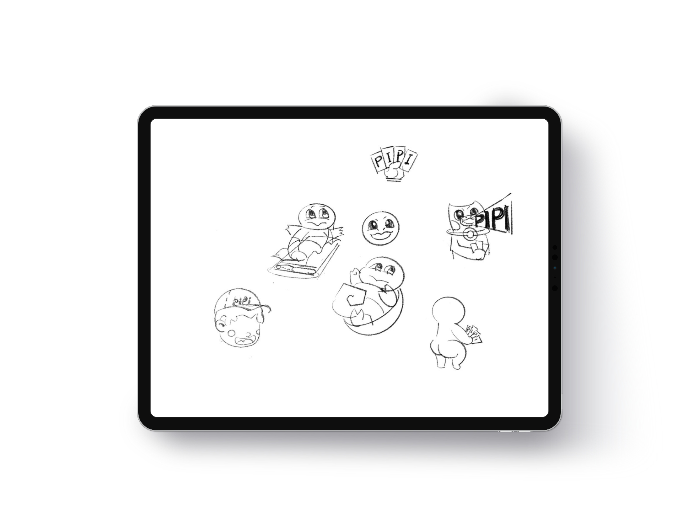
The initial concept involved drawing inspiration from the Pokemon 'Squirtle,' depicting it emerging from a Pokemon card. However, due to copyright considerations, this idea had to be abandoned. In response, I pivoted to creating a character with characteristics reminiscent of famous Pokemon, shouting our brand name 'Pipi.' While this approach had its merits, the visual appeal wasn't optimal. Subsequently, I experimented with the concept of a chubby kid viewed from the back, holding a few cards. This illustration became the foundational element for all design aspects in this project.

Visual ︎︎︎
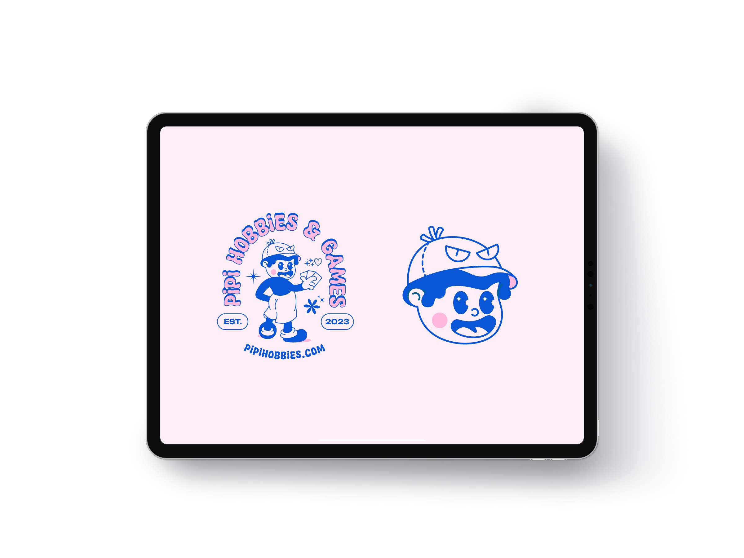
The initial iteration (PIPITCG) was completed within a week and served us well for a few months. However, as we expanded and started on creating a website, I began to notice minor issues with the logo. In the first version, details such as the pants, shirt, eyes, eyebrows, and shoes lacked precision. The facial expression and depiction of the character's features, particularly the butt, appeared odd, and the overall pose felt awkward. Additionally, I found the typography unappealing, with colors appearing pale and not vibrant enough for the desired effect.
Refinement ︎︎︎
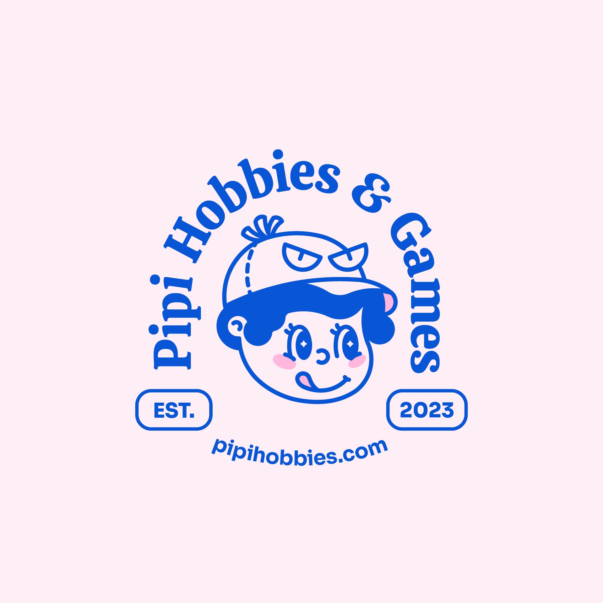
In the redesigned character, I made several enhancements to address previous issues. Notably, I removed the outer circle of the eye and introduced a cap to create a more cohesive hairstyle. The pointy hair was replaced with a bubbly style, drawing inspiration from 'Squirtle's' water type, with the cap incorporating some characteristics of Psyduck. The redesign extended to the shirts, pants, shoes, and overall pose to achieve a more balanced and visually appealing character. To ensure cleaner lines, I used circles as a reference, aiming for a polished outline. With the final logo in place, I proceeded to design our Shopify store, bringing the refreshed brand identity to life.

Final Outcome ︎︎︎

Personal Takeaway︎︎︎
Pipi Hobbies has been a journey of evolution and growth. From the initial concept of drawing inspiration from Pokemon to navigating copyright concerns and eventually crafting a unique and vibrant character, every step presented its challenges and learnings. The iterative process, addressing design nuances, refining details, and ensuring cohesiveness, taught me the significance of adaptability and persistence in design. It was a realization that a thoughtful blend of creativity, research, and strategic adjustments could transform a brand image. This project stands as a testament to the continual refinement and dedication required to create a distinct and appealing visual identity.