Space Debris
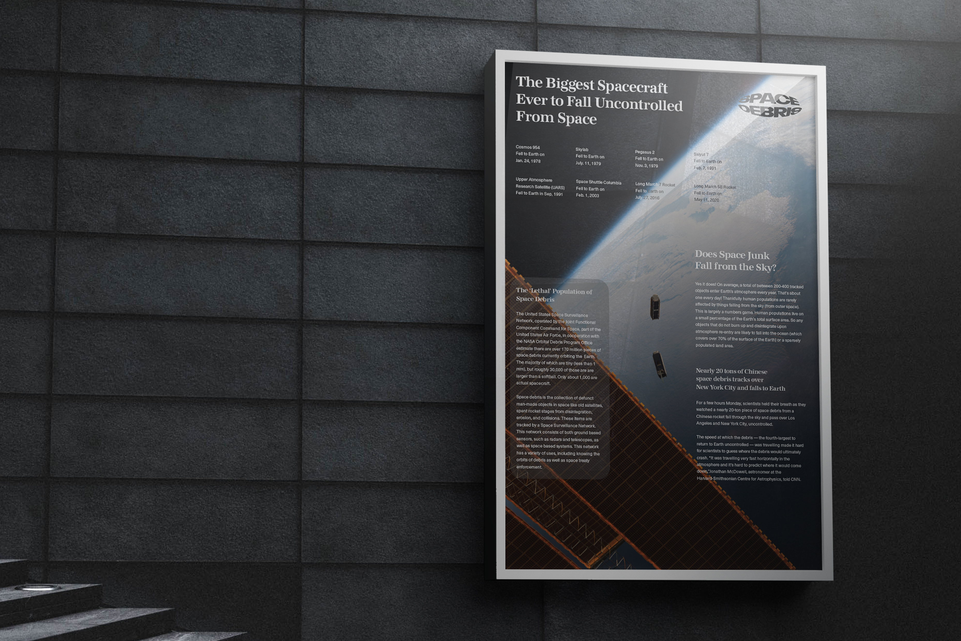
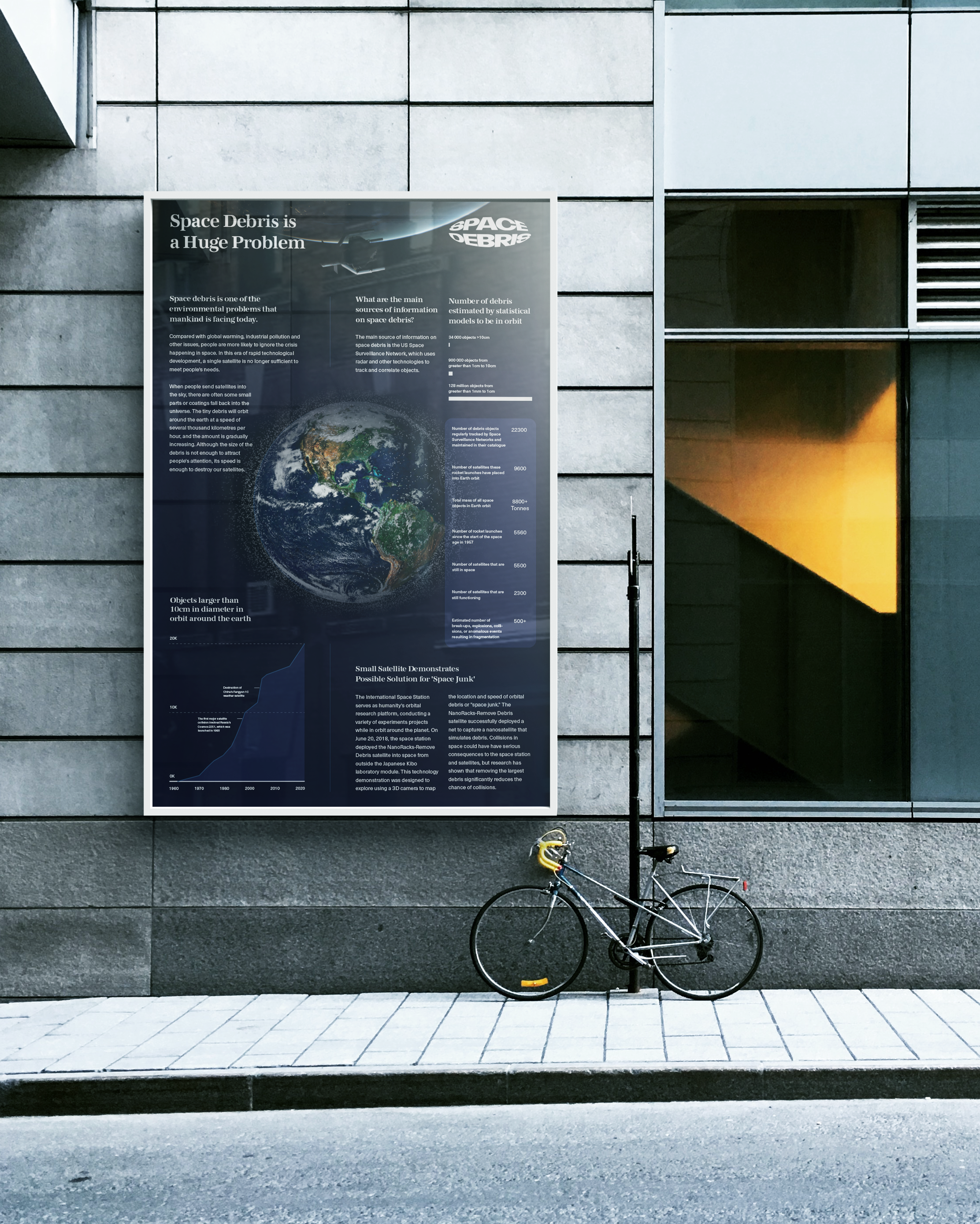
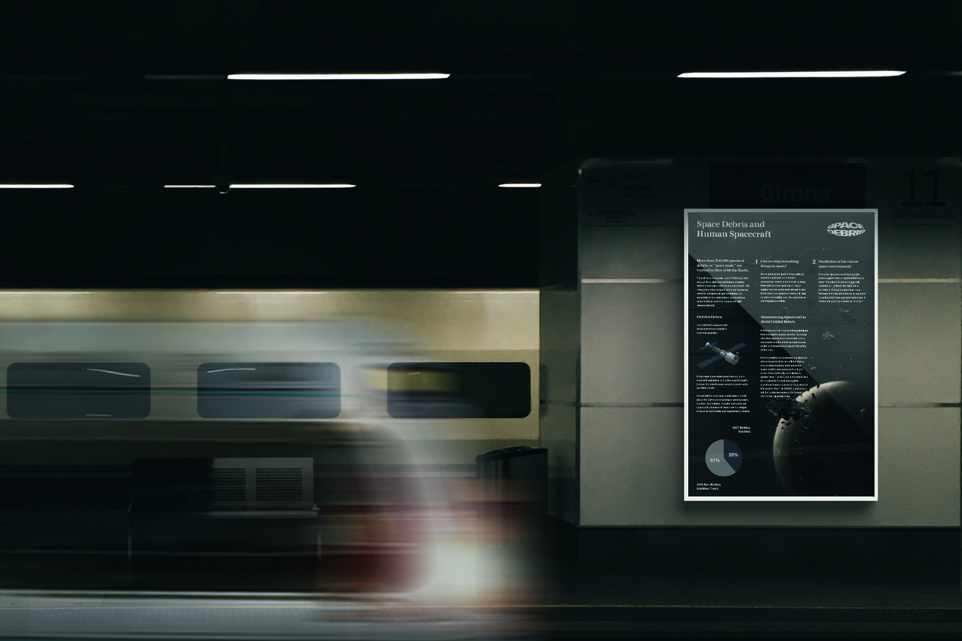
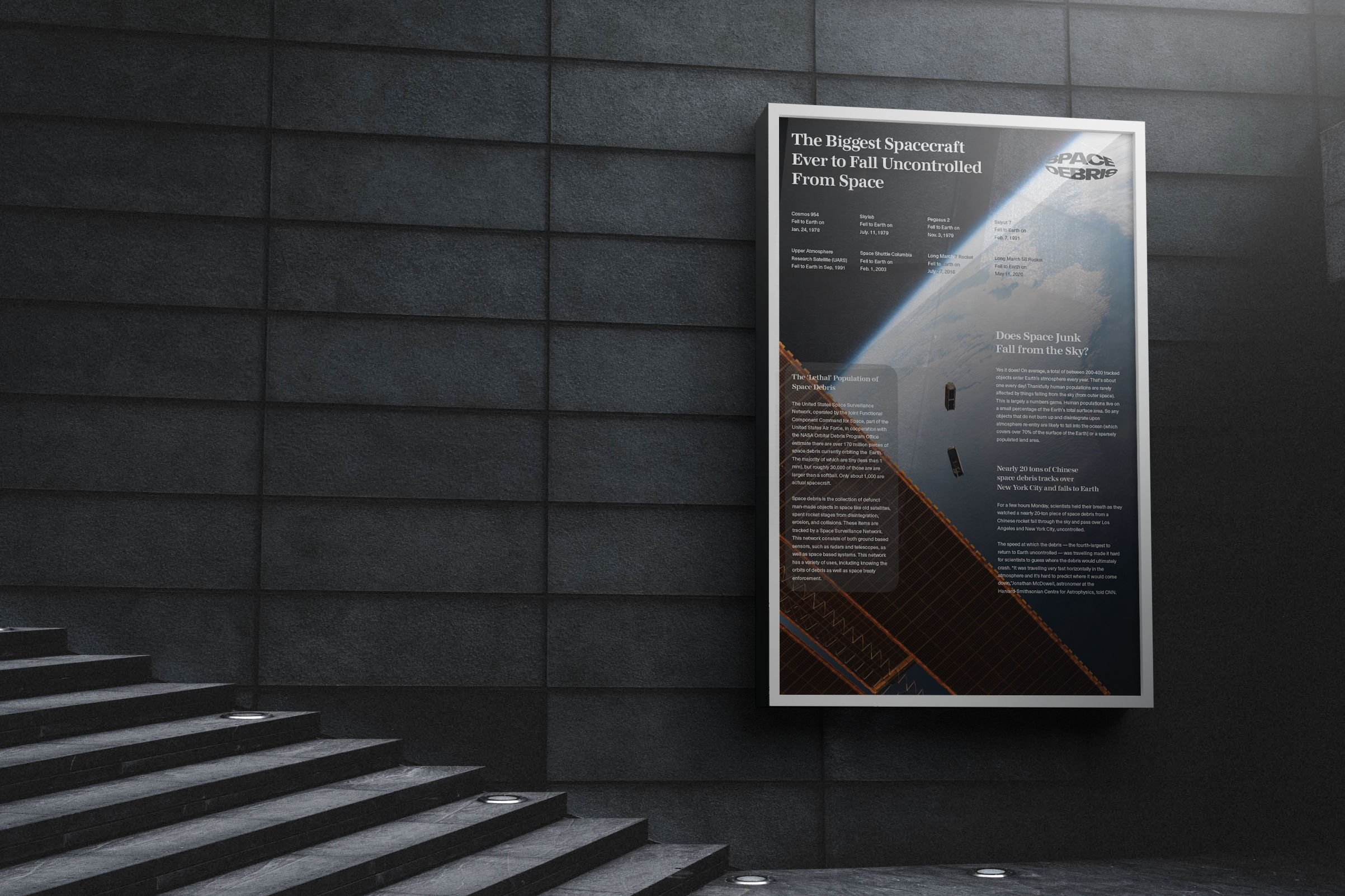
Three educational posters that use imagery, charts and a consistent editorial grid to introduce the problem of space debris to younger audiences.
The starting point
Explain a technical environmental issue for teenagers and young adults. The intended context was a museum or science centre, where visual hierarchy needs to help readers enter a dense subject.
The direction
Develop a connected poster series with shared headers, aligned information blocks and a consistent wordmark. Use diagrams and imagery to organise different aspects of the subject.
A technical subject, organised visually.
How the idea took shape.
01
Give the series a common reading structure.
The layout exploration compares different column arrangements. A consistent grid connects the posters while allowing each page to balance a different mix of charts, text and imagery.

02
Use repeated elements to connect the topics.
Shared headings and the top-right wordmark help the three pieces read as one series. The supporting diagrams give readers additional ways into the subject beyond body copy.
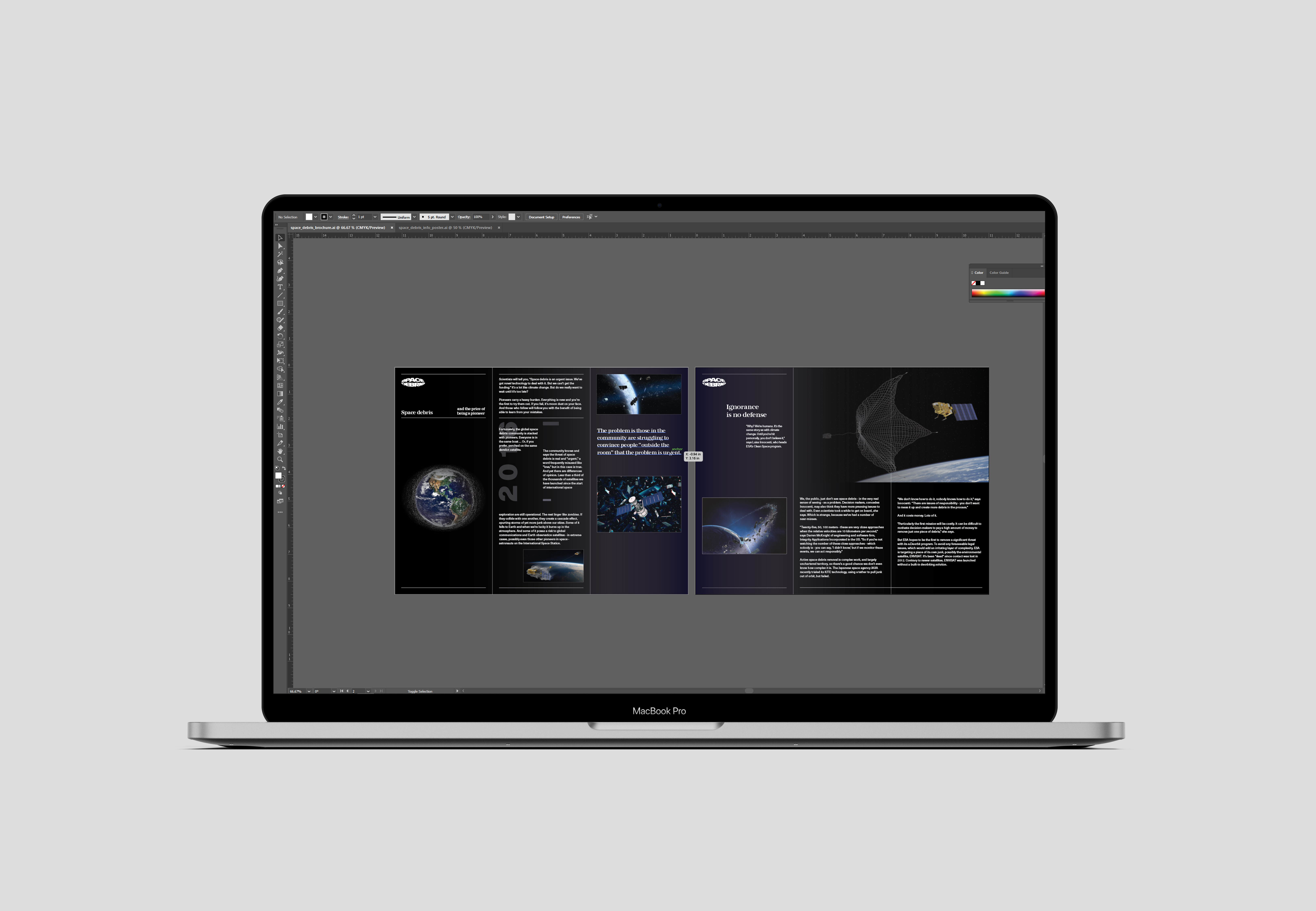
The next presentation revision should include flat poster exports and close-ups of the charts and text. A print-size reading check would help evaluate the hierarchy in the intended viewing context.
Have a project or opportunity?